Interactive map APP for allergen hotspots

THE CHALLENGE
Hay fever, or allergic rhinitis, is an allergic reaction commonly triggered by seasonal pollen exposure, household dust, animal furs, air pollutant and spores (AIHW, 2019). The condition is classified as a chronic respiratory condition and causes runny noses, sneezing and watery eyes, and affects around 15% of Australians (AIHW, 2018), mostly people between 25-44 years of age. There exists medication that aims to relieve the symptoms of hay fever temporarily on the market, such as antihistamines and corticosteroid nasal sprays, for light and severe symptoms respectively (Tonic Health, 2016). It should be noted, however, that the best measure against hay fever is preemptive prevention: identifying allergens that an individual is prone to and minimising exposure to them.
We had some email discussion with MelbournePollen (University of Melbourne, 2020) who agreed to grant us temporary access to their API as a proof of concept. For pollution data, we similarly were granted access to the Airwatch API by the VIC EPA (2020). Unable to find open tree pollen data, we determined we would have to create a function to calculate an estimate for it, using OpenWeather (2020) weather data and the date of predicted upcoming allergen seasons.
system requirement
Joey - Map Tree Feature(Node.js, React.js), CSS Styling (All pages)
Demi - User Feature(Node.js, React.js)
Kai - Tree Data Wrangling(Python,MongoDB)
Linsay - Dashboard Feature((Node.js, React.js))
Simon - Data Modelling
ideation
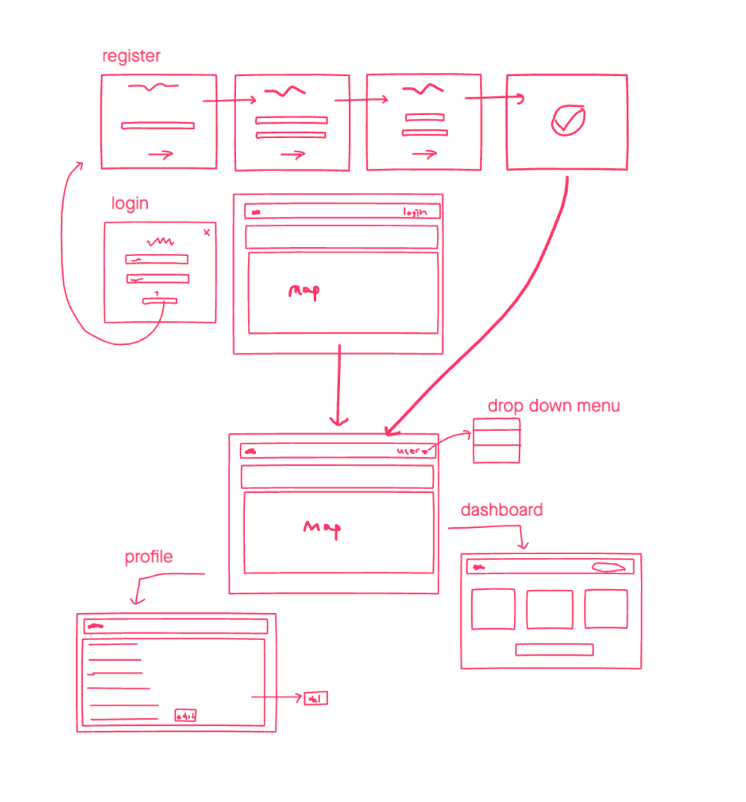
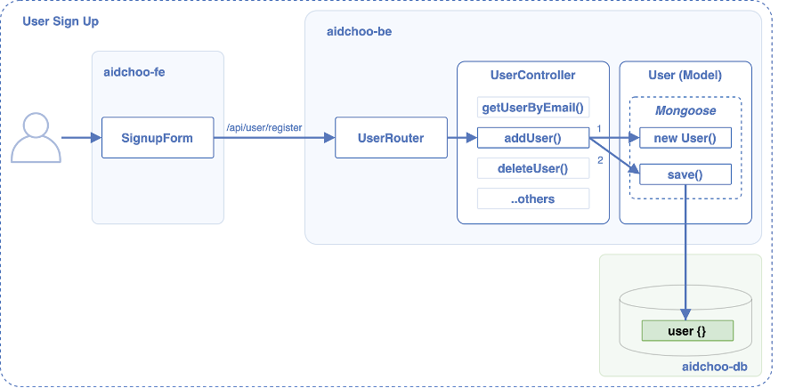
user register
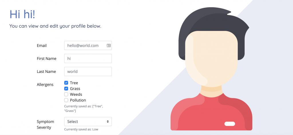
& profile management
The feature also demonstrates its flexibility by allowing users to modify their profile freely. This is important as one’s allergens and severity can change drastically based on factors including new health conditions, age and even moving to a new environment where the flora are more aggressive in their allergen properties.
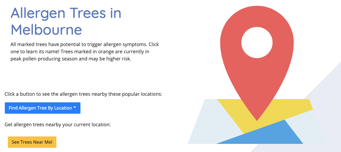
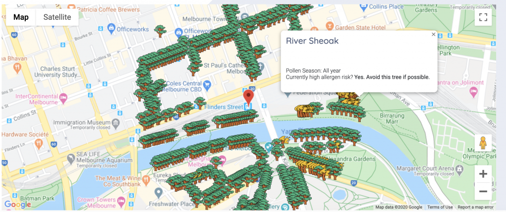
MAP FOR ALLERGEN TREES
The tree data are populated into the backend database hosted on MongoDB, and are fetched and superimposed onto an embedded map using the Google Maps API. Each tree has the following fields: Common Name, Latitude, Longitude and Season. If the tree is in pollen season, it will be coloured yellow, otherwise, it will be coloured green. The map can either be centred on the user’s current location if they allow location access by the browser, or be centred around a set of pre-configured landmarks around the CBD. In either case, trees within range will be displayed onscreen in the aforementioned behaviour. Clicking on a tree will display its name, season and whether it’s currently at high allergen risk. Clicking the drop down button to see the allergen trees nearby selective locations. If the user is logged in and nearby Melbourne CBD, clicking the ‘See Trees Near Me’ to check the allergen trees near the user’s location.
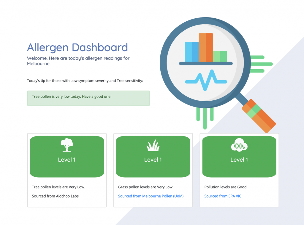
DASHBOARD
The Dashboard conforms to a grid-based layout, which arranges content in a clean and organised manner(TechTerms, 2014).
It serves as a hub of information dedicated to giving insight to the day’s air quality. The three panels showing tree pollen, grass pollen and general pollution are brightly colour coded using conventional schemes: green, yellow and red, which correspond to low, medium and severe with regards to their respective forecasts.
The information for tree/grass/pollution data are sourced from Aidchoo Labs (backend), University of Melbourne and EPA VIC respectively.
The personalised Tip of the Day, which changes daily depending on the day’s pollution and pollen levels as well as user inputs regarding their allergy severity and main allergens. This is helpful as it provides practical advice for users by manifesting different sources of information in a practical and intimate fashion.
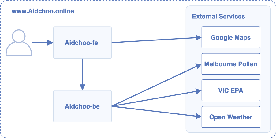
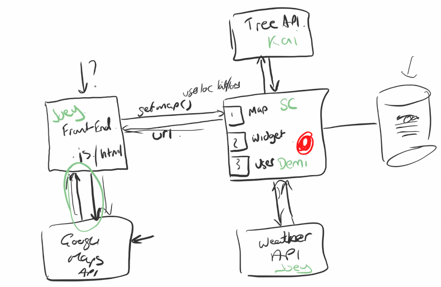
System Architecture
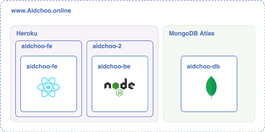
The application follows the typical three-tier model with a front-end, back-end api-server and a database. The front end user interface is developed using React, the back end is a node js api server built using the Express framework and the database is implemented with MongoDB SaaS. We also use external web services to render the map, obtain data on trees for the map and to populate the dashboard with useful information for users.
Front End
The front end is built with the React framework and provides the user interface for Aidchoo. The front end consists of several pages which each host React components which render the content of the site. The components then call back to the aidchoo-be api server to retrieve state and update the interface.
API Server
The api server is implemented using Node.js and the Express web application framework. The code follows the Express model with modules separated into routes, controllers and models, which are further separated for each feature so as to reduce the complexity of the code and ensure maintainability.