The packform design system is a collection of reusable components, guided by clear standards that are conducive to scale, efficiency, and consistency in Design and Front-end Development.
Type
Work Project (Under development, partially finished)
Packform UI was created using a brought UI library, with the development of the company, the business owners would like to refresh the styling and present a more professional brand image. An outsourced marketing agency helped Packform design the new logo, I took over the project and aim to establish a unified UI library for Packform, and maintain a consistent design system across the platform with the new branding.Packform has 4 sites which are dedicated to different roles: customers, dealers, suppliers, and admins. Vue.js is adopted as the front-end tech stack and reusable UI components were shared over the sites. The old UI kit was designed by an outsourced designer years ago, it consists a set of customised components and Element is used as the UI library for some standard components. The old style guide was documented on Notion and Adobe XD, after exploring some design and front-end development tool, we decide to gradually move the design to Figma to initiate better cooperation, and use Storybook for design system documentation.
Styling and design process
I had several meetings and workshops with the stakeholders and marketing agency to settle the new style for Packform, we agreed on the colour pallet and font family for the Packform theme. Considering the complexity of the platform and limited manpower, we decided to update the style of the navigation bar first to make it consistent with the new branding and feel, then gradually define new UI components into the design system across the iterations.
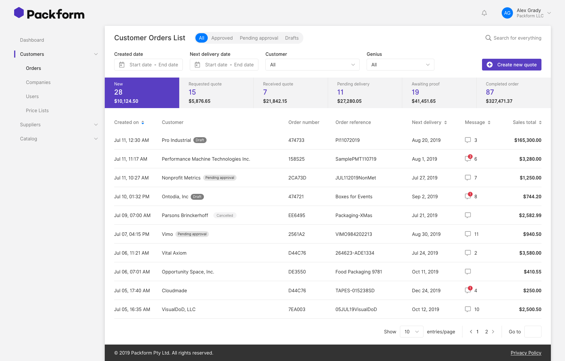
old order List page
The old design was based on the resolution of 1920*1080px and it was not responsive. However, we found 90% of the admins and dealers were using old computers with the resolution of 1366*768 or using the system on their laptop under 1440px for the order/user/content management system.
Users reflected that they need an 80% zoom with their browser to view the full content which makes the text too small to read.
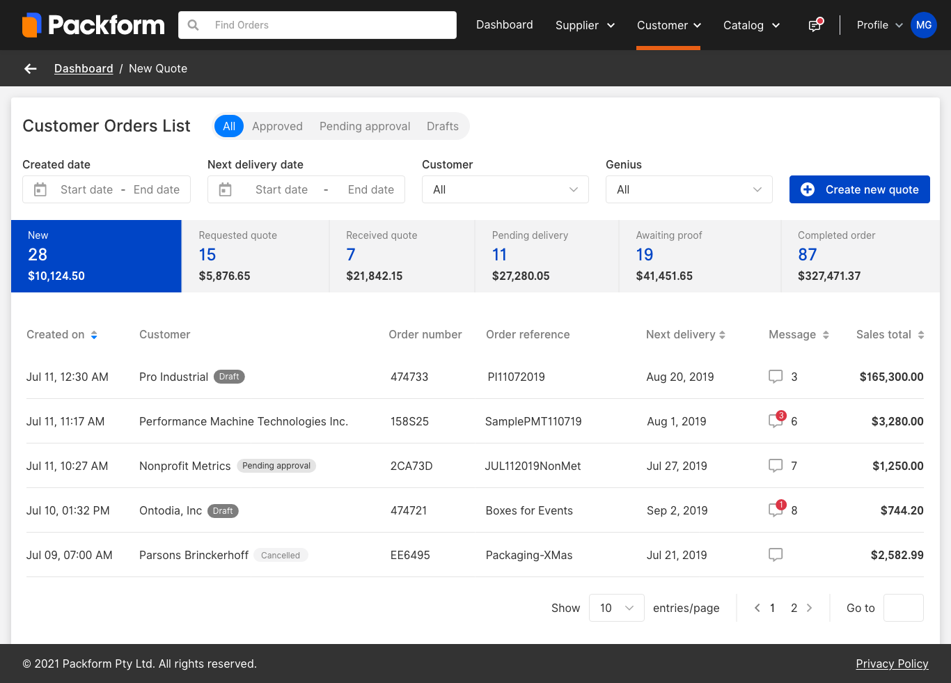
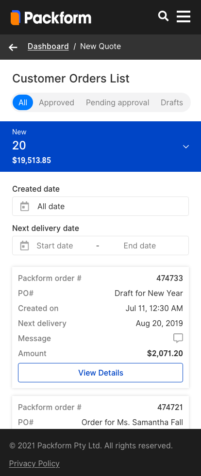
Updated Order List Page
After discussion with developers, there are several responsive principles we considered during the iteration.
Fluid grid is applied and we switched to use percentage (%), viewport height (vh), or viewport width (vw) helps improve adaptability that is not possible with pixels (px). Responsive units such as rem and em units for length instead of px units.
Mobile and content first design principle is considered, 1366px is considered as the base resolution, and navigation bar is moved to the top which gives more space to the main content.
design system tool - storybook & Zeplin
After researching on different tools, we decide to use Storybook and Zeplin for the design system documentation. With the new integration of Storybook and Zeplin, designers will be able to connect the components in the design file with configured UI components in Storybook. This would help developers locate the code of the components in the design system and avoid duplicating the components.
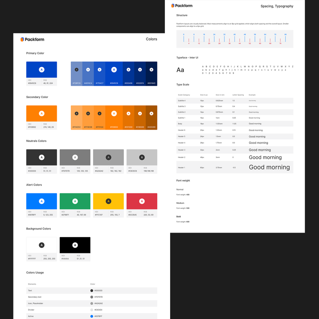
Typography and spacing
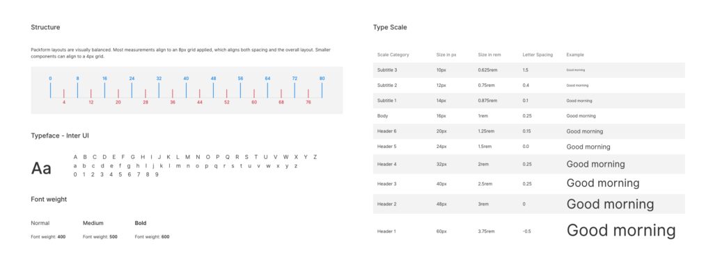
8px grid is applied for the alignment measurement, small components can align to a 4px grid to allow more flexibility. InterUI is used as the base typeface with font weight varieties of 400, 500, and 600. 16px is used as the standard base font size with a range of subtitles and headers.
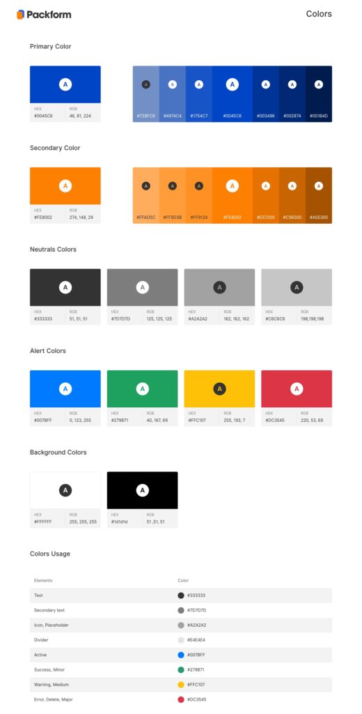
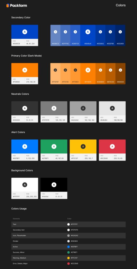
Color Pallet
Blue #0045c6 and Orange # FE8002 are defined as the primary and secondary color for Packform, as the business owner like to have the Packform Website and Customer Catalog E-commerce site in dark theme, we defined the Orange # FE8002 as the primary color in the dark theme as it is more visible.
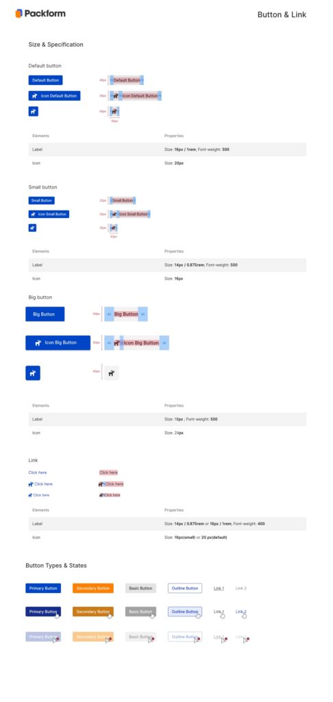
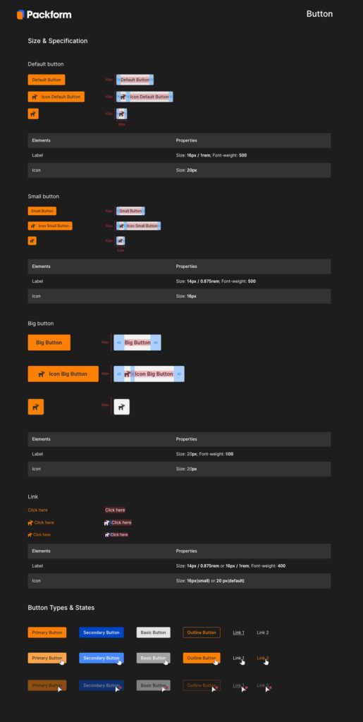
Buttons
Buttons and links with a range of sizes are defined to allow users making different click actions clearly and easily.
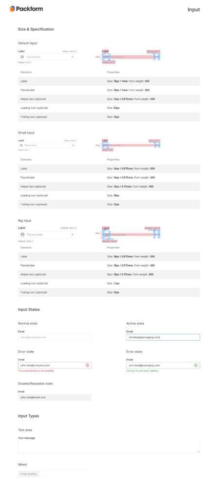
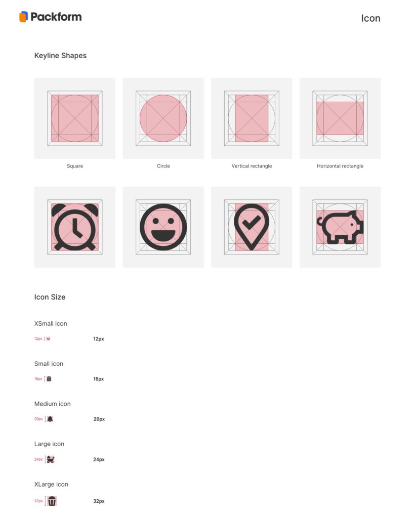
Input Fields and Icons
We defined a range of standard sizes and states for input fields and icons to allow flexibility in different scene and avoid building random and duplicate components in the system.
More packform projects
Have a look at my next case study with Packform, which help simplify the navigation and product searching experience on Packform e-commerce site for customers, the design solution includes enabling search filters, allow customised product ordering, etc.
