Customer Catalog
This project aims to simplify the navigation and product searching experience on Packform e-commerce site for customers.
Type
Work Project
(Under development, partially finished)
My role
End to end
Product Designer
time
2021. 2 - 2021. 6
Team
Project Manager
Engineer: Fullstack team (6)
QA Tester
Challenge Statement
User's Need
After analysing the user session data on Heap Analytics, we found only 13% of customers have successfully sent their order through the customer site.
During the interview with customers, 83% of the customers reflected that they would prefer to call their dealer and tell them the order requests directly. There’re several reasons why they were not sending the order request through the platform:
“The UI is outdated and the texts and product images are too small.”
“The system looks complicated and hard to find the product that I want.”
“Most of my orders involve customised products.”
Impact Perspective
Dealers and admins are spending hours to put in the order details for the customers manually.
The redesign of the customer site would lead more customers directly to the purchase flow, which is expected to increase revenue.
Open the catalog to the public is expected to convert new paid customers.
The key impact of this project is:
“Increase the engagement rate of current user, attract new customer.”
“Reduce personnel costs, save time for the dealers.”
“Enable data analysis on users’ interests and behaviour”
User Stories - Persona
96% of current Packform customers are small business owners based in the US, 70% of their businesses are in the shipping, food& beverage, medical equipment, and agricultural industries.

Stuart Oneil
“Stuart is a 65 year-old farmer who owns a small dairy farm in Texas, he recently built his own brand and attempt to sell his product in the local supermarket. He normally orders 5000 boxes and bottles every week, the amount of packaging items he orders each time depend on the space in his warehouse.”
“The system looks complicated and I have no idea how to place orders, I just need to re-order the same stuff in same amount every week, It’s much quicker for me to just call the dealer.”

Elly Brett
“Elly is a 30 year-old works in a freight company, she handles packaging procurement for the company. One of the packform dealers works with her for a while and source different type of boxes, tapes, and cushioning for them.”
“The searching function doesn’t work well, I’m not able to find boxes or tapes with accurate specs (eg. length, material) , so I need to call the dealer and ask them to create the product for me.”
Understand the problem of previous design
The customer site was designed 2 years ago before packform have many real customer onboard. It consisted of 4 major pages, the catalog page to browse items, a favourites page which contains the saved items, a cart pop up for check out process, and a order list which allows customer to track their current and previous orders. The design file was based on Adobe XD and referred to an outdated style guide.
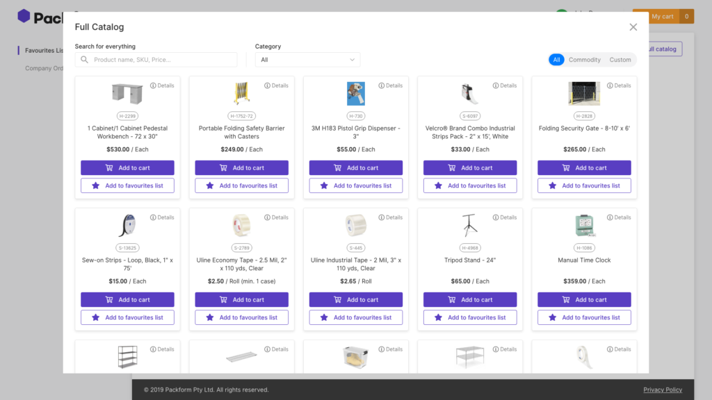
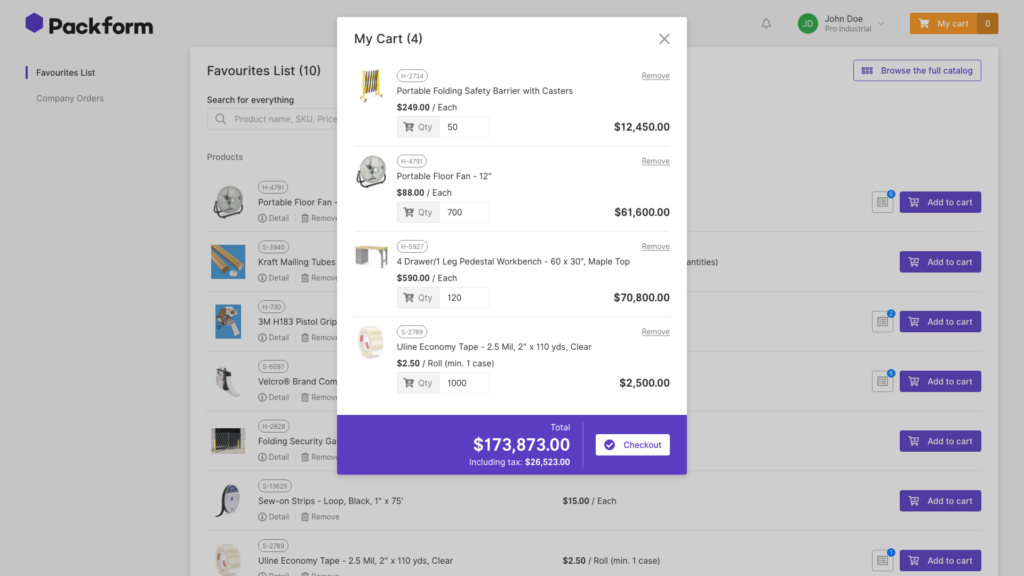
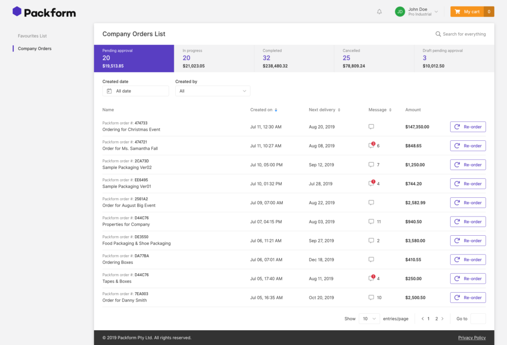


Lack of search filter and product specifications
Difficult to find a specific product with free text search and category filters only. There are many products with similar images but differentiate by their attributes, eg. thickness of tape, material of bags. Users need to click the details button on each grid to read the specifications.
Unable to communicate the requests for customised products
The UI doesn’t allow customers to send specifications for customised products which involved in the 80% of the current order. The current workflow is that customers will call dealers and tell them the request on phone, and dealers will need to input the item details to the system manually so they can send the request to supplier and keep a record of the item.
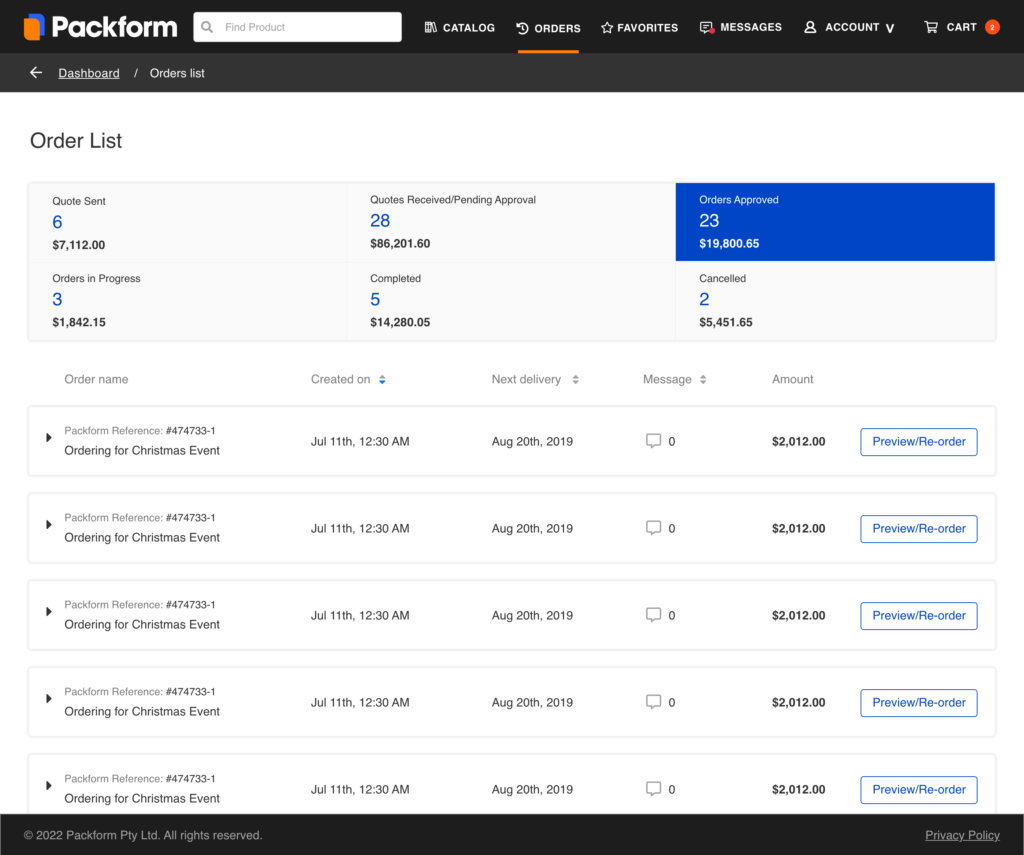
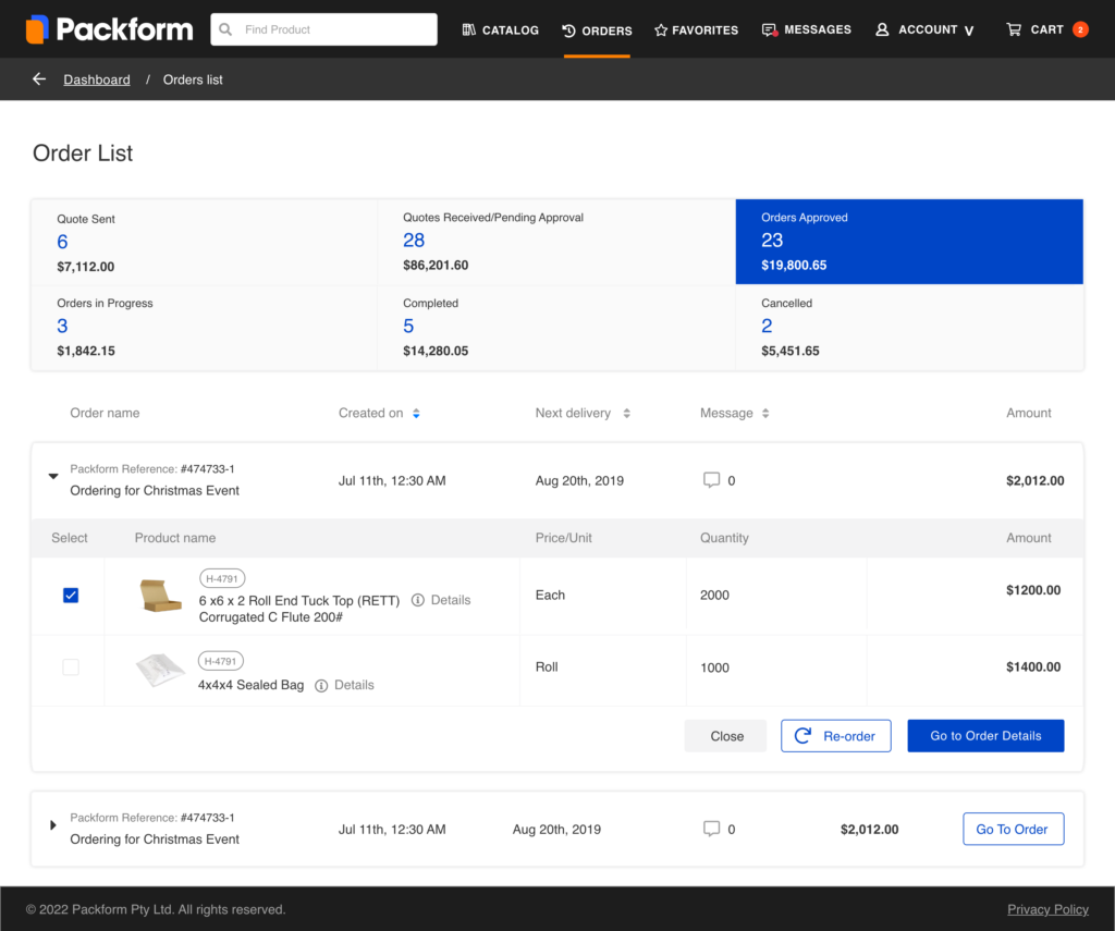
No product information under the oder list for reordering
Re-order was considered in the system, however, the clicking rate of the button was pretty low even for active users. After interviews, we found out that users need to go into the order to look at the products before the action, however, the re-order button was only available on the order list screen
Ideation - Design Principles
After defining the problems we need to solve, I summarised the design principle and objective with the product manager and tech lead.
01
Easy to navigate and find the product that users want. Give users a more familiar e-commerce experience
02
Update the layout, keep it simple and clear. Make mobile-first design, enable users to browse items easily and place orders on the mobile site.
03
Allow users to order customized products, make the check-out flow more clear to increase conversion rate.
04
Enable one-click re-order while allowing customers to preview the product details under each order before the action.
product grid and Details Pop up
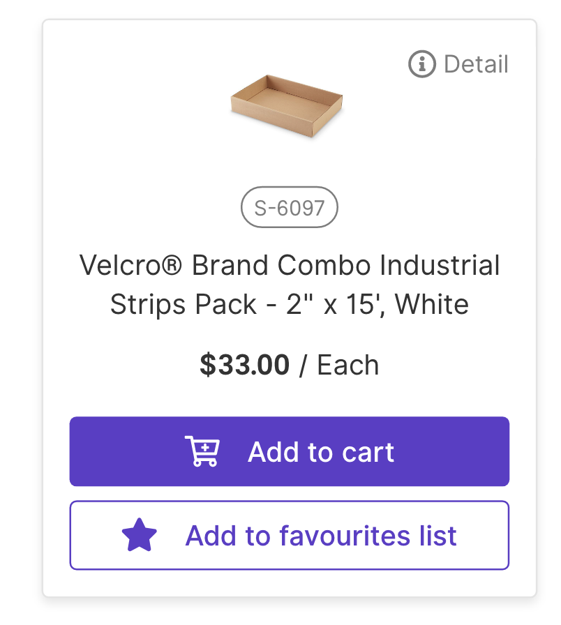
The design for the search flow went through three iterations. We tried to keep the user flow similar as a simple e-commerce site and took Kogan, Amazon, Officeworks as our reference. However, unlike most of the consumer product, the product images in the packaging industry could look similar.
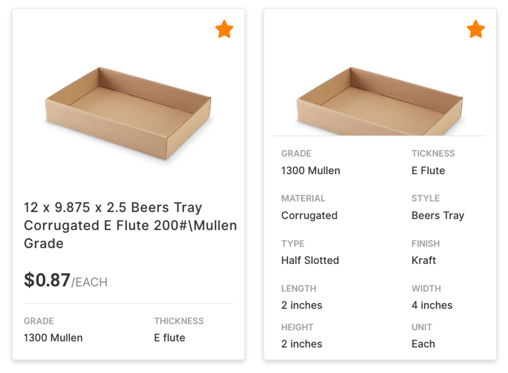
According to our Business Analyst, 80% of the sales on Packform come from Box category. Customers and experienced dealers reflected that the specifications they care the most about a box item are the style, material, size, and thickness.
According to customer’s feedback:
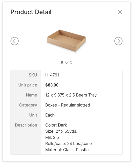
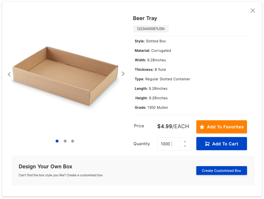
“I need to click the ‘detail’ button to read the specifications of each item to find the product that fits my need which is annoying”
After discussion with the tech lead, we decided to make a customised component for the product grid which allows users to hove over each product grid and have a peek on the specifications.
To make sure the design will be able to cope with the actual product data, I used Google Sheet plugin to fill the design with real product data.


Filters and Mobile View
To give a more familiar e-commerce searching experience, I made the filter sits on the left side of the web view and right-hand side on mobile.
We had some debate on how to filter the size attributes. We released a version which combined the length x width x height of a product and found the list was too long to allow customers make an effective search.
And some user reflected that they can’t tell if 6x6x8 in the product name is L x W x H or W x L x H, we decided to display them as separate fields in the filter and details.
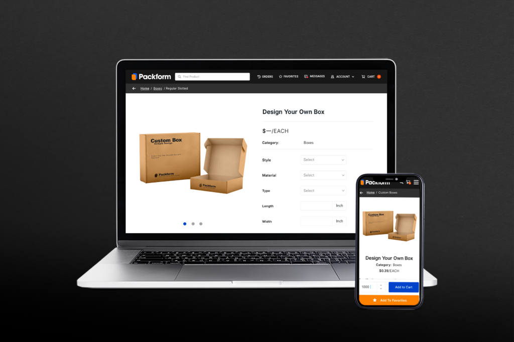
Customised Product Wizard
Fix gallery position while scrolling
The initial idea of the customising wizard was introducing 3D modelling and allow users to have a direct view on the product they designed. However, after long discussion with the tech lead and exploration of possible engine, we decided to introduce a basic version in the interim considering the technical limitation. The product image is designed to stick while scrolling to give the users a more personalised experience.
mobile responsive Navigation
To provide a user friendly and native app alike navigation experience, the top menu, breadcrumb and the action buttons are designed to be sticked during scrolling. This prevent users from scrolling to navigate freely on mobile.
Order Tracking and Re-order
The product preview is added under each order so users can expand the order and select the product they need to reorder, we found that this feature helped increased the clicking through rate of the reorder button by 60%.
